
 By
By 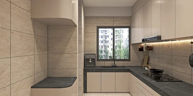
Key Highlights
- Grout colour affects a tiled space almost as much as the tile itself, yet it’s often chosen as an afterthought.
- Matching grout creates a seamless, quiet look, while contrasting grout turns the tile layout into a visible feature.
- Bold grout choices work best in small, deliberate doses rather than across an entire room.
- Budget and colour choice are connected, since certain finishes and shades affect both look and cost.
Nobody plans a kitchen around their grout. They agonise over the tile, the layout, the exact shade of the countertop, and then pick whatever grout the installer happens to have on hand. Weeks later, the result looks slightly off, and it’s rarely the tile’s fault. More often than not, it’s the colour grout quietly working against everything else in the room.
Swatch One: The Disappearing Act
Matching grout to tile is the safest move in the book, and for good reason. When the two are close enough in shade, the lines between tiles all but vanish, leaving a smooth, continuous surface that reads as one unified material rather than dozens of individual pieces. This works particularly well in smaller spaces, where visible grout lines can make a room feel busier or more fragmented than it needs to.
The trade-off is that this approach hides the tile’s shape entirely. A beautifully laid herringbone or a large-format tile loses some of its visual impact if the grout lines disappear into the background rather than tracing the pattern for the eye to follow. It’s a safe, reliable choice, but not always the one that gets a tiled floor noticed.
Swatch Two: The Quiet Line
A step up in boldness, subtle contrast keeps things calm while still letting the tile layout show through. Think a warm grey grout against off-white tile, or a soft taupe against pale stone. The difference is gentle enough that it doesn’t dominate the room, but present enough to define each tile’s edges and give the floor or wall a bit more depth and texture than a fully matched finish.
This middle-ground option tends to age well too, since it’s forgiving of minor colour variation between tile batches, something that becomes more noticeable with an exact colour match. For most homes, this is genuinely the sweet spot, enough definition to look intentional, without tipping into a look that feels loud a few years down the line.
Swatch Three: The Statement Move
Then there’s bold contrast, dark grout against light tile or vice versa, which turns the grid itself into a design feature. This works brilliantly in the right setting: a geometric floor pattern, a feature wall, a small powder room where drama is welcome. It’s a much riskier choice across an entire open-plan kitchen or living area, where the grid pattern can start to feel overwhelming rather than intentional once it’s repeated across dozens of square metres.
If a bold contrast genuinely appeals, it’s often worth trialling it on a smaller feature first; a splashback, a bathroom accent wall, before committing to it across a larger space. That way, the drama stays a deliberate choice rather than something that quietly takes over the whole room.
Where Budget Meets Palette
Colour isn’t the only variable worth weighing up here. Stain-resistant formulations, epoxy-based options, and specialist finishes all affect both durability and price, and it’s worth understanding this before falling in love with a particular shade. A good overview of tile grout in Singapore pricing can help set realistic expectations before committing to a colour that might come with a premium finish attached.
Getting this part right early saves a fair bit of back-and-forth later, since swapping grout colour after installation is a far bigger job than choosing carefully the first time around. A short conversation with whoever’s doing the tiling, before a single tile goes down, tends to be far cheaper than a redo once the grout has fully cured.
Tile gets chosen first, but grout decides how the whole room actually reads once the dust settles.
Not sure which palette suits your space? Grout ProTech can help you find a colour and finish that actually works for your home. Contact us today!




Comments